A wedding venue website has a big job.
Couples may arrive because they saw your venue on Instagram, found you through Google, clicked an ad, or heard your name from a friend. Once they land on your website, they are trying to decide whether your venue deserves a spot on their shortlist.
That decision starts with the obvious questions.
Where are you located? What does the venue look like? How many people can it hold? What does it cost? What is included? Can they picture their wedding there?
Then comes the question that matters most to the venue owner: Will they take the next step?
Many lists of the best wedding venue websites focus heavily on beautiful design, creative layouts, and impressive photography. Those things matter. A venue is selling a highly visual experience.
A strong website also needs to help a couple make a decision.
The best sites give visitors enough information to build interest, rule the venue in or out, and move toward pricing, availability, an inquiry, or a tour.
Here is what that looks like in practice.
8 Things the Best Wedding Venue Websites Get Right
The best wedding venue websites make it easier for couples to decide if a venue belongs on their shortlist.
That requires more than strong photography. Couples need enough context to understand the property, determine whether it could work for their wedding, and know what to do when they are ready to learn more.
If you are evaluating your own website, look at it like someone who has six venue tabs open. These are the eight areas worth paying the closest attention to.
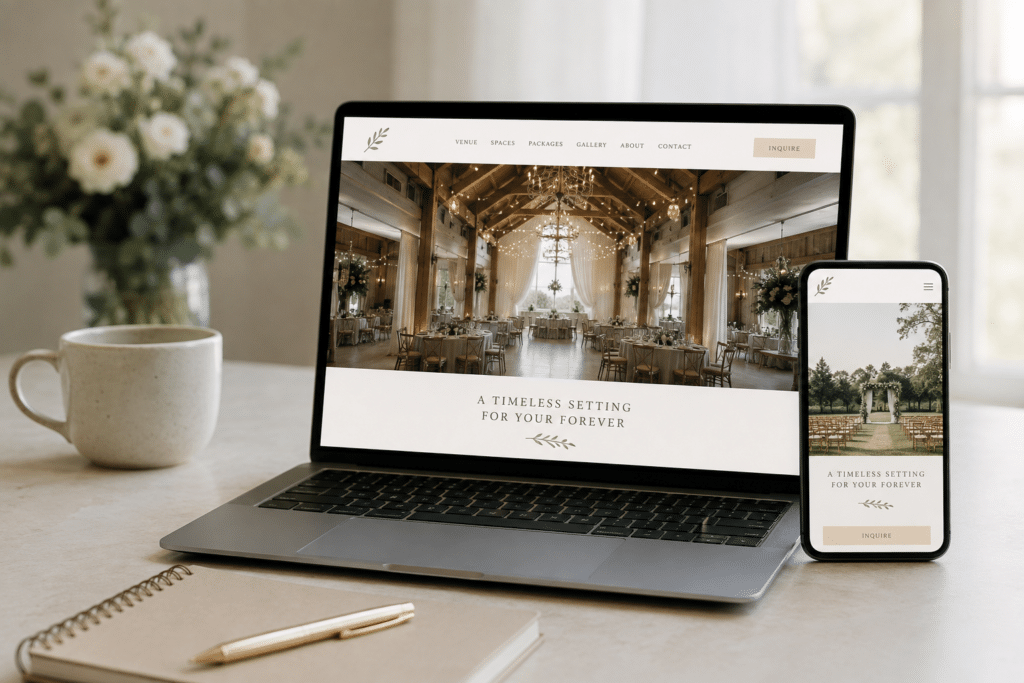
1. The First Screen Tells Couples What They Need to Know
Start with what someone sees before they scroll.
A couple should be able to get basic context about the venue almost immediately.
That usually means showing:
- A strong image or video of the actual venue
- The venue’s city, region, or general location
- A concise description of what makes the property distinctive
- A clear call to action
Romantic copy has a place on a wedding venue website, but it should still communicate something useful.
A headline such as “Where Forever Begins” could describe thousands of venues. A headline that references a riverfront setting, historic estate, mountain property, modern ballroom, vineyard, or another defining feature gives the visitor something concrete.
Location deserves the same treatment.
Couples frequently search within a particular city or region. Your homepage should not make them hunt through the footer to figure out where you are.
Making that location clear can also support your broader SEO for wedding venues strategy by giving searchers and search engines stronger geographic context.
2. There Is One Clear Primary CTA
Every venue website needs a primary action.
Depending on your sales process, that might be:
- View Pricing
- Get the Pricing Guide
- Check Availability
- Request Information
- Schedule a Tour
You can offer more than one action across the website, but one should be clearly prioritized.
When one section says “Contact Us,” another says “Learn More,” another says “Book Now,” and another says “Let’s Chat,” the path starts to feel scattered.
Choose the action that best matches how couples enter your sales process and use it consistently.
For many venues, pricing works particularly well as an early conversion because couples are still researching. Someone who requests your pricing guide today may be ready for a tour after they have reviewed the information.
Other venues may have enough demand or brand awareness to send visitors directly toward a tour.
Your CTA should also fit into your larger venue marketing strategy. Ads, SEO, social media, lead capture, follow-up, and the website itself work better when they are directing couples toward the same defined next step.
3. Couples Can Find Pricing Without Hunting for It
Pricing is one of the biggest qualification questions couples bring to a wedding venue website.
You do not have to publish every package, upgrade, seasonal adjustment, and optional service on the homepage.
You should give visitors some way to understand the likely investment.
That could be:
- Starting investment
- Typical price range
- Package pricing
- Minimum spend
- A downloadable pricing guide
This allows couples to answer an important question before either side invests time in a sales conversation.
Should a Wedding Venue Website Show Pricing?
In most cases, yes.
That does not mean every venue needs a public rate sheet.
If your pricing changes according to the date, season, guest count, package, or services selected, a pricing guide can provide useful context while leaving room to explain the details later.
Pricing visibility also affects lead quality.
If your venue typically requires a $12,000 investment, someone working with a $4,000 venue budget is unlikely to become a booking because the price was hidden.
They are more likely to become an inquiry your team eventually has to qualify out.
Give couples enough information to decide if pursuing the venue makes financial sense.
4. The Photography Actually Shows the Venue
Beautiful wedding photography is valuable.
The problem starts when a venue’s website is filled with beautiful photos that barely show the venue.
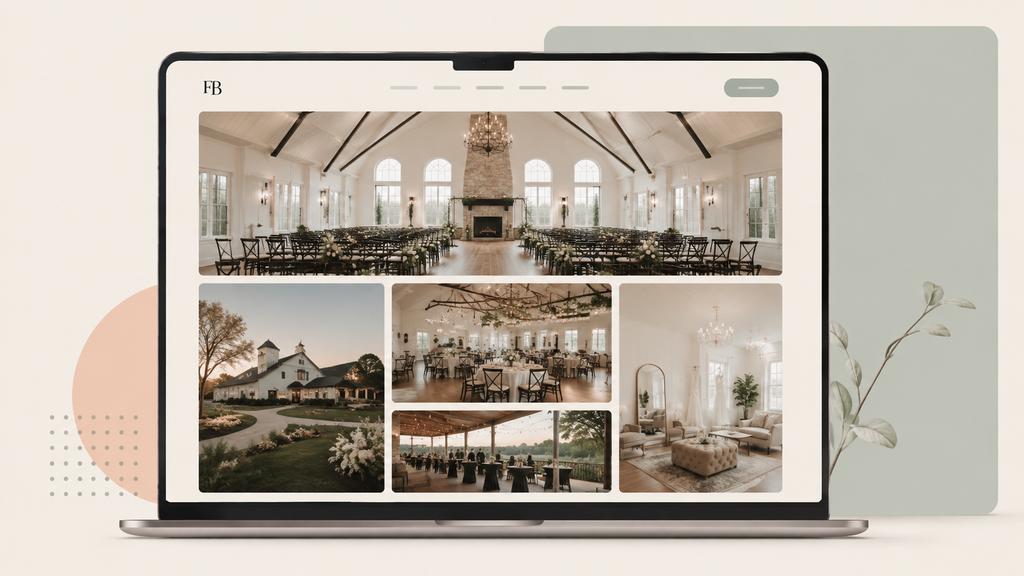
A gallery of close-up portraits, bouquets, rings, table details, and wedding-party photos can leave a prospective couple with very little understanding of the property itself.
Make sure your website shows:
- Ceremony spaces
- Reception spaces
- Exterior views
- Entrances and arrival areas
- Getting-ready spaces
- Cocktail-hour areas
- Tables and room layouts
- Outdoor areas
- Evening atmosphere
- Different ceremony configurations
- Different seasons when relevant
Think about what a couple is trying to picture.
- Where will they get ready?
- Where will their guests arrive?
- What does the ceremony look like with chairs set?
- How does the reception room feel with tables, florals, and people in it?
- Where does cocktail hour happen?
- What does the property look like after dark?
Your photography should help them answer those questions.
5. Couples Can Find the Information They Need to Self-Qualify
Couples do not need to read your entire contract before contacting you.
They do need enough information to decide if the venue could realistically work for their wedding.
Make the basics easy to find:
- Guest capacity
- Location
- Ceremony options
- Reception options
- Getting-ready spaces
- Major package inclusions
- Parking
- Nearby accommodations when relevant
- Indoor or weather backup options
- Important venue policies
- Frequently asked questions
Capacity is a simple example.
If someone is planning a 175-person wedding and cannot find your capacity anywhere on the website, they may have to submit an inquiry just to find out if the venue is even an option.
That creates extra work for the couple and your team.
An FAQ page can handle many of these practical questions without crowding the homepage.
6. There Is Proof From Real Couples
A wedding venue can say that its team is responsive, attentive, organized, and wonderful to work with.
Reviews from actual couples carry more weight.
Look for testimonials that say something specific about:
- Communication
- Planning support
- Venue staff
- Wedding-day experience
- Flexibility
- Guest experience
- Condition of the property
A testimonial saying “This venue was amazing!” provides very little information.
A review explaining how the coordinator handled a weather change, how responsive the team was during planning, or how guests reacted to the space gives future couples something they can use.
Real wedding galleries can reinforce that proof.
They show prospective couples how different weddings have used the property and give them more ways to picture their own celebration there.
7. The Website Works Well on a Phone
Do not judge the mobile version of your website by opening the homepage once.
Walk through the entire experience.
Can you comfortably:
- Read the copy?
- View the gallery?
- Find pricing?
- Tap the CTA?
- Read the FAQs?
- Complete the inquiry form?
Speed matters here too.
Google recommends that Largest Contentful Paint, which measures how quickly the primary content on a page appears, occur within 2.5 seconds for a good user experience.
Wedding venue websites can easily become heavy because of large image galleries, background videos, and oversized image files.
Pay attention to image sizing, compression, video use, and anything else making visitors wait before they can see the page.
8. The Inquiry Form Only Asks for What You Actually Need
Your inquiry form is where anonymous website traffic becomes a lead.
That makes every required field worth questioning.
There is no universal number of fields that works for every wedding venue.
Research from the Baymard Institute gives us a useful principle to work from. In its ecommerce usability research, Baymard found that the number of form fields users have to consider has a greater effect on usability than the number of steps in the process.
A wedding venue inquiry is obviously different from an ecommerce checkout. The useful takeaway is much broader: the more information you ask someone to provide, the more work you are adding to the interaction.
For many wedding venues, an initial inquiry might only need:
- Name
- Phone number
- Preferred wedding date or timeframe
- Estimated guest count
Then look critically at everything else.
- Do you need their full mailing address right now?
- Do you need a detailed description of the wedding before anyone has spoken with them?
- Does “How did you hear about us?” need to be required?
- Do you need several dropdown menus covering details your sales team could ask later?
Your team may eventually need some of that information. It does not necessarily need to stand between the couple and their first inquiry. Ask for enough information to begin a useful conversation, and save the rest for the conversation itself.
Run This 15-Minute Wedding Venue Website Audit
Now that you know what to look for, the next step is seeing how your own website measures up.
You do not need analytics software or a full redesign to spot the biggest gaps. A quick review of the homepage, pricing, photos, mobile experience, and inquiry path can tell you a lot.
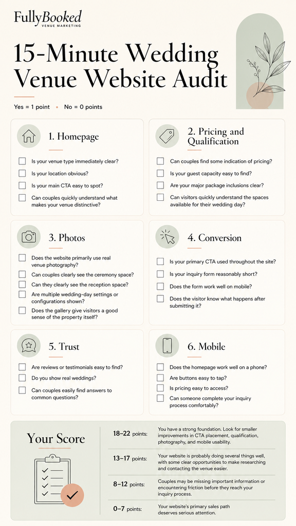
A score is only a starting point.
The more useful question is: Where did you lose points?
Three missing points around photography point to a different issue than three missing points around pricing, CTA placement, and forms.
That gives you a much clearer place to start.
What to Fix First If You Only Have a Weekend
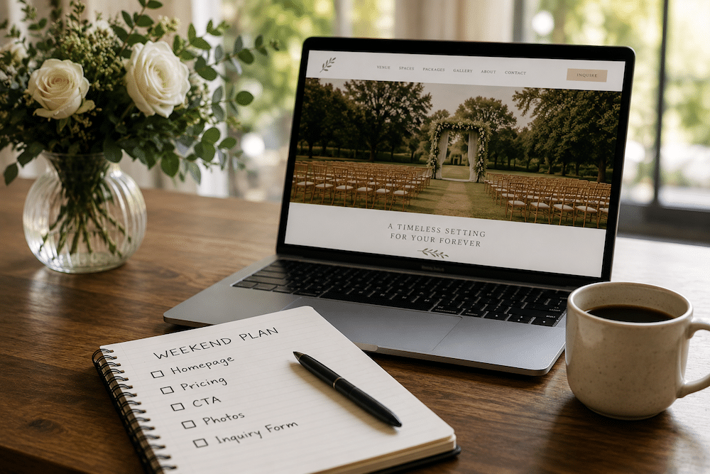
A full website project takes time. If you want to make meaningful improvements without rebuilding the whole thing, start with the areas closest to the inquiry:
1. Fix the First Screen of the Homepage
Open your homepage on a phone.
Can someone immediately tell:
- What kind of wedding venue you are?
- Where you are?
- Why they might want to keep looking?
- What they should click?
If any of those answers are unclear, start there.
2. Add a Pricing Signal
Give visitors some way to understand the likely investment before they reach out.
That could be a starting price, package range, typical investment, or pricing guide. You do not need to publish every possible package detail, but couples should be able to tell whether your venue is realistically within reach.
A clear pricing signal can also help improve lead quality by filtering out inquiries from couples whose budgets are far outside your normal range.
3. Choose One Primary CTA
Decide which action matters most and make that the clearest next step across the site.
For one venue, that may be downloading a pricing guide. For another, it may be checking availability or scheduling a tour. Whatever you choose, use the same CTA language consistently across your main pages so visitors recognize it immediately.
That consistency also helps reduce hesitation. Couples should not have to stop and interpret a new button every time they move to another section of the site.
4. Shorten the Inquiry Form
Look at every required field and ask whether you genuinely need that answer before someone from your venue can respond.
Keep the information that helps you qualify or follow up with the lead, such as contact details, wedding date, and guest count. Move secondary questions to a later conversation when possible.
A shorter form asks less of someone who is still in the research stage and gives them fewer reasons to abandon the inquiry halfway through.
5. Improve the Photo Mix
Review your homepage and gallery from the perspective of someone who has never visited the property.
If most of your strongest images are portraits, florals, table details, or close-up wedding moments, add more photos that clearly show the venue itself.
Include wide shots of ceremony and reception spaces, different layouts, getting-ready areas, outdoor spaces, and evening setups. Couples should be able to understand how the property looks and how the wedding day actually moves through it.
6. Test the Entire Experience on Your Phone
Go through the website the way a prospective couple would.
- Start on the homepage.
- Find your capacity.
- Look for pricing.
- View your ceremony and reception spaces.
- Read a review.
- Locate the CTA.
- Submit an inquiry.
Write down every moment where you had to hunt for information, scroll farther than expected, wait for something to load, or think about what to do next.
Those moments become your website to-do list.
Your website is also one piece of the larger question of how to book more weddings at your venue. If the website experience is solid and bookings are still falling short, look at traffic, lead generation, follow-up, tours, and the rest of the sales process as well.
Is Your Wedding Venue Website Doing Its Job?

The best wedding venue websites make it easy for couples to understand the venue, picture their wedding there, answer their major qualification questions, and choose a next step.
It’s true that great photography gets attention, but the rest of the website has to turn that attention into action.
If your traffic is growing but tour requests are not following, your website may be one of the first places worth looking.
Fully Booked Venue builds and optimizes wedding venue websites and funnels around the actions that matter most, from reviewing pricing to requesting a tour.
See How Fully Booked Venue Works
Find out where your current website may be losing prospective couples.